Rendering Components
Rendering components control the visual appearance of scene objects - from basic mesh rendering to particle effects, 3D text, and procedural shapes.
Object Renderer
Section titled “Object Renderer”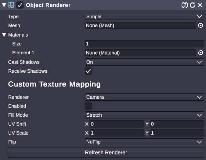
🏷️ Category: Rendering
💡 Simple Explanation: Controls how a 3D object looks - its mesh, materials, and shadows.
⚙️ Technical Description: A unified rendering component that abstracts mesh rendering, skinned mesh rendering, and UI image rendering into a single interface with material management and shadow control.
📖 Full Details & Properties
🔧 How It Works: The Object Renderer automatically detects what type of object it’s attached to (static mesh, animated/skinned mesh, or UI image) and provides a consistent way to manage materials and rendering settings. It handles material reference tracking so assets stay loaded when in use.
✨ Perfect For:
- Changing materials on any object type
- Controlling shadow casting and receiving
- Swapping textures at runtime
📋 Properties:
| Property | Type | Description |
|---|---|---|
| Type | Dropdown | Rendering mode: Simple (static), Complex (skinned), or UIImage |
| Materials | Material Array | List of materials applied to the object |
| Material | Material | Shortcut to the first material |
| Cast Shadows | Dropdown | Shadow casting mode: On, Off, Two Sided, Shadows Only |
| Receive Shadows | Boolean | Whether the object receives shadows from other objects |
🎬 Streaming Example: “Change the material on your logo when someone subscribes to make it glow.”
🎯 Tips: Most 3D objects automatically get an Object Renderer. You rarely need to add it manually. Use the Material property for single-material objects, or Materials array for objects with multiple material slots.
Particle Player
Section titled “Particle Player”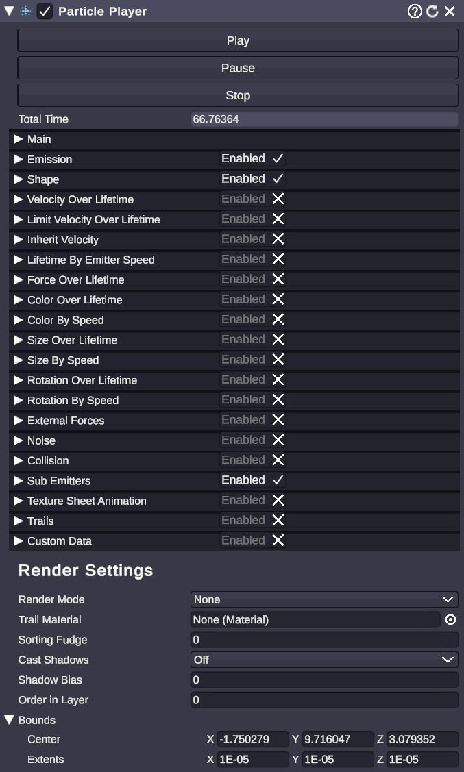
🏷️ Category: Rendering
💡 Simple Explanation: Plays particle effects like fire, smoke, sparkles, and explosions.
⚙️ Technical Description: A wrapper component for particle systems that provides simple Play/Pause/Stop controls and manages the underlying particle system and renderer components.
📖 Full Details & Properties
🔧 How It Works: When added to an object, Particle Player automatically creates and manages a particle system. Use the Play, Pause, and Stop buttons to control playback. The particle system’s detailed settings (emission rate, colors, size over lifetime, etc.) are accessible through the component’s extended properties.
✨ Perfect For:
- Celebration effects (confetti, fireworks)
- Ambient effects (dust, fog, sparkles)
- Impact effects (explosions, hits)
- Magic and spell effects
📋 Properties:
| Property | Type | Description |
|---|---|---|
| Play | Button | Start playing the particle effect |
| Pause | Button | Pause the effect (particles freeze in place) |
| Stop | Button | Stop the effect and clear particles |
🎬 Streaming Example: “Trigger a confetti explosion when someone gifts 10 subs.”
🎯 Tips: Particle Players can be triggered from node graphs using the ComponentSetProperty node to set the Play trigger. For complex effects, import particle prefabs from the asset catalog.
Trail Renderer
Section titled “Trail Renderer”
🏷️ Category: Rendering
💡 Simple Explanation: Draws a fading trail behind moving objects, like a comet tail or light streak.
⚙️ Technical Description: Renders a ribbon-like mesh that follows an object’s movement, with configurable width, color gradient, and fade-out time.
📖 Full Details & Properties
🔧 How It Works: As the object moves, the Trail Renderer records its positions and draws a smooth ribbon connecting them. The trail fades out over time based on the Time setting. You can control the width at the start and end, apply color gradients, and assign materials for different visual effects.
✨ Perfect For:
- Motion trails on fast-moving objects
- Light painting effects
- Swoosh effects on animations
- Highlighting movement paths
📋 Properties:
| Property | Type | Description |
|---|---|---|
| Time | Float | How long the trail persists (seconds) |
| Start Width | Float | Width at the object’s current position |
| End Width | Float | Width at the trail’s tail |
| Color | Gradient | Color over the trail’s length |
| Materials | Material Array | Materials applied to the trail |
| Min Vertex Distance | Float | Minimum distance before adding new trail points |
🎬 Streaming Example: “Add a glowing trail to your animated mascot as it flies across the screen.”
🎯 Tips: Set End Width to 0 for a pointed tail effect. Use a lower Min Vertex Distance for smoother trails on slow objects, higher for performance on fast objects.
3D Text
Section titled “3D Text”🏷️ Category: Rendering
💡 Simple Explanation: Creates text as a 3D object with depth, like carved letters you can rotate and light.
⚙️ Technical Description: Generates extruded 3D mesh geometry from text input, with configurable fonts, depth, beveling, and separate materials for front face, sides, and bevel edges.
📖 Full Details & Properties
🔧 How It Works: The 3D Text component takes your text string and generates actual 3D geometry - not a flat texture. Each letter becomes a mesh with depth (extrusion) and optional beveled edges. You can assign different materials to the front face, side walls, and bevel surfaces for varied looks. The text responds to scene lighting and casts real shadows.
✨ Perfect For:
- Floating channel names and logos
- 3D title cards
- Dramatic text reveals
- Signs and labels in virtual sets
📋 Properties:
| Property | Type | Description |
|---|---|---|
| Text | String | The text content to display |
| Font | Dropdown | Font selection from available fonts |
| Size | Float | Scale of the text |
| Depth | Float | How far the text extrudes (thickness) |
| Bevel | Float | Amount of edge beveling (0 = sharp edges) |
| Bevel Style | Dropdown | Shape of the bevel (Round, Flat, etc.) |
| Front Material | Material | Material for the text face |
| Side Material | Material | Material for extruded sides |
| Bevel Material | Material | Material for beveled edges |
| Shadow Cast Mode | Dropdown | Shadow casting behavior |
| Receive Shadows | Boolean | Whether text receives shadows |
| Major Layout Style | Dropdown | Horizontal alignment (Left, Center, Right) |
| Minor Layout Style | Dropdown | Vertical alignment |
| Line Spacing | Float | Space between lines of text |
| Letter Spacing | Float | Space between characters |
🎬 Streaming Example: “Display ‘100 SUBS!’ as giant 3D text that spins into view during milestone celebrations.”
🎯 Tips: Keep Depth reasonable - very deep text looks odd. Use different materials for front and sides to create interesting contrasts. The Bevel property adds polish but increases geometry complexity.
Vector Shape
Section titled “Vector Shape”🏷️ Category: Rendering
💡 Simple Explanation: Creates crisp 2D shapes like circles, stars, arrows, and rectangles that stay sharp at any size.
⚙️ Technical Description: Procedurally generates 2D vector geometry for various primitive shapes, with separate fill and stroke materials for maximum flexibility.
📖 Full Details & Properties
🔧 How It Works: Vector Shape generates actual mesh geometry for 2D shapes rather than using textures. This means shapes stay perfectly crisp at any scale or camera distance. Each shape has a fill (interior) and stroke (outline) that can have different materials. The specific properties available depend on the selected shape type.
✨ Perfect For:
- UI backgrounds and frames
- Decorative elements
- Arrows and pointers
- Progress indicators
- Geometric patterns
📋 Properties:
| Property | Type | Description |
|---|---|---|
| Rebuild | Button | Regenerate the shape mesh |
| Shape | Dropdown | Shape type (see list below) |
| Fill Material | Material | Material for the shape interior |
| Stroke Material | Material | Material for the outline |
Available Shapes:
- Rectangle, Rounded Rectangle
- Ellipse, Ellipse Ring
- Regular Polygon, Rounded Polygon
- Star, Octagon
- Arrow, Quadrilateral
- Grid, Advanced Grid
- Path, Poly Line, Dashed Poly Line
- Plane
🎬 Streaming Example: “Create a rounded rectangle background for your webcam border that matches your brand colors.”
🎯 Tips: After changing shape-specific properties, click Rebuild to update the mesh. Use transparent fill with a colored stroke for outline-only shapes. Each shape type reveals additional properties specific to that shape (like corner radius for rectangles or point count for stars).
Dynamic Shadow Box
Section titled “Dynamic Shadow Box”🏷️ Category: Rendering
💡 Simple Explanation: A 3D box where each side can have a different material - perfect for rooms and display cases.
⚙️ Technical Description: A parametric 3D model that generates box geometry with named material slots for each face, allowing independent material assignment per side.
📖 Full Details & Properties
🔧 How It Works: Unlike a standard cube that uses one material everywhere, the Dynamic Shadow Box has separate material slots for each face (Front, Back, Left, Right, Top, Bottom). You can drag different images, videos, or materials onto each side. The box rebuilds its geometry when you change parameters.
✨ Perfect For:
- Virtual rooms and stages
- Display boxes for products
- Multi-screen setups
- Skybox-like environments
- Video walls
📋 Properties:
| Property | Type | Description |
|---|---|---|
| Build | Button | Rebuild the box geometry |
| Material Slots | List | Named slots for each face (drag materials here) |
🎬 Streaming Example: “Create a virtual streaming room with different wallpapers on each wall and a video playing on the back wall.”
🎯 Tips: If materials don’t appear after dragging them, click the Build button. You can put videos on any face to create dynamic environments. Combine with lighting for realistic room setups.
Sticky Canvas
Section titled “Sticky Canvas”🏷️ Category: Rendering
💡 Simple Explanation: A display that sticks to the camera view like a HUD overlay, but exists in 3D space.
⚙️ Technical Description: A specialized render surface that automatically positions and scales itself to fill the camera view, creating screen-space-like overlays while remaining in world space for lighting and effect interactions.
📖 Full Details & Properties
🔧 How It Works: Every frame, the Sticky Canvas calculates the camera’s position and field of view, then positions itself to perfectly fill the view at a specified distance. This creates the illusion of a 2D HUD overlay, but because it’s actually a 3D object, it can receive lighting, cast shadows, and interact with post-processing effects.
✨ Perfect For:
- HUD overlays that need 3D effects
- Always-visible chat displays
- Camera-following graphics
- Sticker effects
📋 Properties:
| Property | Type | Description |
|---|---|---|
| Render On All Cameras | Boolean | Show on every camera or specific ones |
| Cameras | List | Specific cameras to display on (if not all) |
| Content | Material | The material/image/video to display |
| Canvas Distance | Float | How far from the camera the canvas sits |
🎬 Streaming Example: “Keep your chat overlay visible at all times, even when switching between different camera angles.”
🎯 Tips: Canvas Distance affects how the canvas interacts with other 3D objects - closer means it renders in front of more things. If you want true screen-space UI without 3D interaction, use a regular Canvas component set to Screen Space Overlay instead.